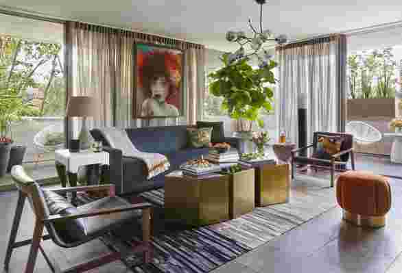
When used correctly, a surprising color combo can turn a drab room into a dynamic one. “An unexpected combination of colors creates visual interest and cohesion in a room,” explains designer Breegan Jane . “It’s also a reminder that design doesn’t have to be confined to what is most obvious. There are so many more opportunities to add meaningful nuance to a space.”
Interested in turning up the volume on the hues at work in your space? I asked eight design pros what unexpected color pairings can work wonders in a humdrum room, and here’s what they recommended along with proof—photos of said shades at work in their own projects or homes.

Sage green and steel blue
Instead of keeping the color palette in her kids’ bathroom super neutral, blogger Victoria Ford of Prepford Wife went for a bold, coastal-inspired pairing of sage green and grayish blue that paid off handsomely. After installing Capri blue striped floor tiles from Codicer , she painted the vintage sink in Sherin-Williams’ Privilege Green to create a cool, nautical scene. “We used Fresh Kicks by Clare, a bright white, on the walls to balance things out and allow the two key colors to really shine,” she says. The resulting room isn’t your typical navy blue and red nautical fare, and that’s exactly why it feels so fresh and unexpected.
Chartreuse and black-and-white
Searching for a design-savvy way to energize a classic black-and-white color scheme? Designers Tavia Forbes and Monet Masters of Forbes + Masters suggest bringing a jolt of greenish yellow into the mix. “When thoughtfully applied, a pop of bright chartreuse can become the focal point of a black-and-white space,” Masters explains. “However, the application has to be intentional and apparent, such as an accent wall or a statement furniture piece.”
Purple and orange
According to designer Rachel Cannon of Rachel Cannon Limited , a dash of purple and orange can go a long way in dressing up an all-white kitchen or room. “One of my favorite unexpected color combos is eggplant and tangerine,” she says. “It adds a layer of interest to a traditional space that’s refined but also refreshing.”
Magenta and yellow
When it comes to furnishings, as long you balance out the boldness of this energetic combo with softer, neutral shades, designer Melissa Warner Rothblum of Massucco Warner says you can employ both magenta and yellow items in a room. “Use deep gray or ivory to ground the brightness of magenta and yellow and to keep the palette sophisticated and refined,” she says.
Purple and green
Looking for a foolproof way to subdue a commanding piece of colorful artwork in a room? Designer Gail Davis recommends painting the walls a rich, saturated shade of green. “In this home’s stair hall, I chose Benjamin Moore’s Yellow Green to accent the client’s fantastic art in warm earth tones and an oil [painting] in a vibrant purple hue,” she says. “The colors were all cool, but the sharp contrast was exciting and graphic. It really elevates a utilitarian space and makes it electric.”
Pink and teal
When working with architecture that doesn’t provide a natural break between rooms, artist and interior stylist Ashley Whiteside suggests painting each space a unique color. “In this space, the entryway and dining room are extremely fluid, but I wanted more distinction on the dining, so I painted it a bright rosy pink (Clare’s Rosé Season ),” she explains. “Although the deep blue-green walls of the entryway create contrast, they complement each other in every light and at all times of day.”
Turquoise and yellow/gold
Tying to pinpoint an eye-catching color combo that mixes warm and cool hues and is subtle enough not to overwhelm a space? Jane suggests pairing turquoise with yellow or gold. “I utilize this color combination in my own designs by choosing a wood flooring color that includes lighter yellow tones in it as a base,” she explains. “Then I take a deep turquoise-colored upholstered piece of furniture and let it pop against the light warm flooring. Gold accents help accentuate the color scheme and bring out more of the gold undertones in the flooring.”
Blue and orange
If it’s a high-contrast, high-impact color combination you’re after, designer John McClain says to look no further than the classic color wheel combo of blue and orange. “Complimentary colors, by nature, explode off each other,” he explains. “In this Los Angeles pied-à-terre, wood tones and metallic accents play supporting roles to the navy sofa and rust ottoman, bringing them together like a happy family.”

Leave a Reply