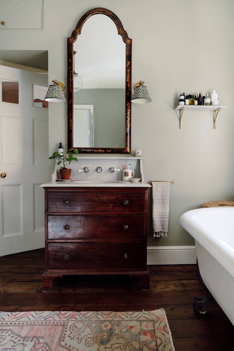
When it came to decorating the master bathroom in her Georgian farmhouse, Louise Roe was stuck for ideas until a chance encounter with Russell Crowe gave her the inspiration she needed

I never thought I’d cite Russell Crowe as source for my interior design inspiration, but there’s a scene in A Good Year – a film about a rather bullish finance exec who inherits his uncle’s French chateau and with it learns a slower, more meaningful way of life – that stopped me in my tracks. He washes his face at a Victorian vanity in the bedroom of his crumbling, beautiful château; the piece of furniture is tall, made of wood and marble, chipped and charming in a very authentic way.
At the time of watching the film, I was halfway through renovating our home and unsure how to decorate the master bathroom. It was incredibly important to me that we restored the house with a sensitivity to its roots as a Georgian farmhouse. In the hallway, for example, we discovered and polished up a long Victorian mosaic hiding under flagstones; in the drawing room, we installed a ceiling rose to replace one that had fallen down due to a flood many decades prior and never been replaced.
Fashion stylist Louise Roe's Georgian farmhouse
GEORGIAN
Fashion stylist Louise Roe's Georgian farmhouse
The master bathroom was a big and sunny space but it had lost its flow; there was an unnecessary step up to the loo, a huge modern shower that dominated the room and a single pedestal sink with no storage, looking very lonely. We replaced lino flooring with reclaimed floorboards. We placed a roll-top bath on legs under a window - still with its original Georgian glass panes, full of air bubbles and wobbly imperfections. The room was starting to feel old again, in the best possible way. As I came up with ideas, I had Nancy Lancaster in the back of my head, whose advice is that that a bathroom shouldn’t feel any different to a drawing room; she advocated filling it with furniture and antiques to make it feel comfortable and so I just couldn’t wrap my head around putting a brand new shiny vanity and tiled backsplash in there, it felt too clean and clinical. Without even knowing it was what I was looking for, Russell Crowe set me off on a DIY spree to make my own version of his vanity.
Firstly, I needed to find an antique chest. Given I was planning to chop its head off for a sink and screw plumbing holes into the back – an act I felt weirdly guilty about, as if it were a living thing – I wanted something on the cheap and battered side. The other factor was getting the right dimensions. Most Victorian chests are too tall to work as a vanity and old dressing tables are too short. After a few hours of searching, I found mine on LoveAntiques.com through a small dealer in Newcastle for £160. Next, my husband and I found an oval under-counter basin at Victorian Plumbing and sketched its measurements with tracing paper on top of the chest to check it would fit. We also searched for wall-mounted taps that had a long enough spout to reach into the sink, allowing space for the imagined backsplash. I was a total amateur, working off a couple of Pinterest photos I had found.
The final part needed experts. We had worked with Caesarstone quartz in our bathroom in Los Angeles, where we had moved from, and I loved how creative they were with ideas. I sent them my inspiration picture of the vanity, which had a short backsplash and in-built shelf above, all with fairly intricate edge profiling on a thin piece of quartz. Rather than pointing out potential problems, the team were animated by the proposal and even suggested making a couple of separate bathroom shelves with any leftover stone so that it didn’t go to waste.
My excitement levels were very high on installation day; it was a special moment to see something translated from my imagination to an actual piece of working furniture. I finished off the room with more antiques, including a tall Chinoiserie mirror and Chinoiserie chair with a broken cane seat (I love it that way and don’t want to repair it, much to my husband’s eye-rolling!) which I found on eBay for £50. The colour scheme migrated towards a mustard and green combination: the walls are 'Ball Green' by Farrow & Ball, the blind is 'Butterscotch' corduroy by Rose Uniacke, and the sconces are Pooky. The artwork of Kew Gardens is by Lucille Clerc from Print Club London, and the fraying rug was a bargain vintage find on Etsy, that used to be in our kitchen over in LA. I am so glad we created something entirely bespoke for the bathroom: it feels like a very unique centrepiece that ties in all the items around it – old and new.
One tip from the carpenter: add thin MDF or wooden panels to the inside of the top drawer to create little compartments of usable space – that way you don’t lose the entire drawer to the bottom of the sink.
I chose honed quartz in London Grey from Caesarstone, a simple, soft tone with no shine.
The shelves are made from the leftover stone.
Our vanity was sturdy, but some chests will need to be reinforced, especially if the stone you use on top is extremely thick and heavy.
The Chinoiserie chair was an eBay find.
A mustard yellow blind above the freestanding bath is made from Rose Uniacke's Butterscotch corduroy.

Leave a Reply