This article originally appeared in the November 2014 issue of Architectural Digest.
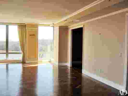
You can’t imagine what this place looked like," Nora Jordan says of her refined apartment in Washington, D.C., going on to recall a hodgepodge of busy wall coverings, off-the-shelf moldings, unattractive ventilation grilles, mediocre herringbone parquet, and out-of-fashion track lighting. "And it had zero storage," she adds.
The 3,800-square-foot residence’s four bedrooms were also more than she and her husband, André—a Polish-born journalist turned developer of golf courses and luxury resorts, notably Quinta do Lago in Portugal’s Algarve region—really required. A cosmopolitan couple who jet between Lisbon, London, and Rio de Janeiro, the Jordans acquired the Washington pied-à-terre because family members live in the area. Perhaps the property’s greatest appeal was its prime Georgetown location, with the Potomac River flowing right outside its south-facing windows.
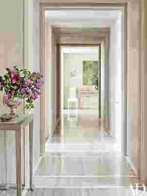
To convert the spacious but unremarkable apartment into a finely tailored getaway, the Jordans turned to Solís Betancourt & Sherrill , a Washington design firm known for striking a balance between understated elegance and extreme precision. Partners José Solís Betancourt and Paul Sherrill smartly reconfigured the floor plan for two-person living. A guest room next to the master suite became a dressing area and small retreat for André (Nora calls it his "snooze box"). Another bedroom, adjacent to the living room, is now the library. As for the utilitarian corridor that connects the entrance hall to the bedrooms, a silvery travertine floor crossed with bands of white marble transformed the passage into a formal hall with rhythm, proportion, and scale. "It’s a subtle change, but it makes the space more interesting," notes Solís Betancourt.
Careful attention was paid to seamlessly integrating functional elements such as ventilation grilles, recessed lights, sprinkler heads, and speakers. "We tried to hide or at least center the sprinklers when we could, to make them appear less intrusive. They’re always such an eyesore," Sherrill says. In the master bedroom, hollow ceiling beams house downlights and speakers and give structure to the room without losing much ceiling height. Streamlined air vents are tucked neatly behind soffits or worked almost invisibly into baseboards and crown moldings.
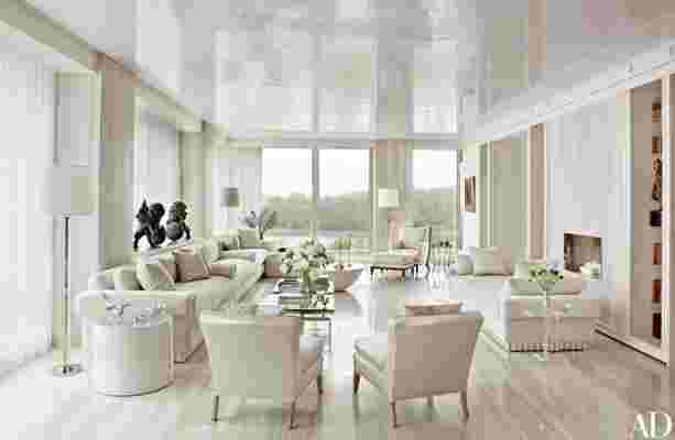
The designers also installed masses of storage—shelving, cabinets, drawers. Shallow closets surround a seating area in the master bedroom. In the living room built-in shelves filled with antique leather-bound books frame a new fireplace’s travertine chimney breast and flank the entrance to the library. "Every square inch that was empty we made into storage," says Solís Betancourt, as Sherrill adds, "There are hidden doors everywhere." The more than 20 floor-to-ceiling mirrored panels in the dining room harbor shelving for Meissen and Vista Alegre porcelain and felt-lined drawers for silverware. "Like José and Paul, I’m a perfectionist. Everything has its place," Nora explains. "I don’t like clutter, and I don’t like a mess." To keep out noise and exhaust fumes from traffic (a freeway runs adjacent to the building), the designers added a third layer of glass to the double-paned windows—an improvement that also keeps the space virtually dust-free.


Having fine-tuned the apartment’s structure, Solís Betancourt and Sherrill turned their attention to the decor. "I wanted something of an Art Nouveau or Art Deco look, but combining different elements," Nora says. "I think if you have all modern or all antiques, it gets boring. You have to mix things up." Solís Betancourt describes the results as having "a dusting of Art Deco," pointing out features such as ivory-painted doors trimmed with silver leaf, a custom-made sofa and daybed with platinum-leafed fluted bases, a tree-shaped floor lamp, and classic crystal sconces in the form of exotic birds. "Nora wanted a very glamorous environment," says Sherrill.

Leave a Reply