The first New York City apartment that Lisa and Michael Lehman shared was a Chinatown studio that lacked sufficient storage space . “Lisa was doing everything she could to create more,” Michael says, “including putting a full-sized dresser under the bar counter in lieu of stools.” Years later, when the couple found themselves the new owners of a Romanesque Revival triplex in Park Slope, Brooklyn, they faced challenges of a different sort.

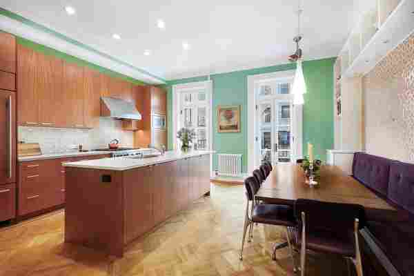
BEFORE: The kitchen Lisa and Michael inherited featured cherry cabinetry, which read as orange against turquoise walls.
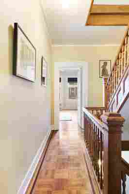
The 2,800-square-foot space, largely untouched for some 20 years, lacked the sort of family-friendly functionality that the pair, now parents to a young daughter, desired in a long-term living space. What’s more, honey-toned wood flooring and accents contributed to an overall lack of brightness, and many of the structure’s original details had been obscured or overpowered by a dated color palette that ranged from bright turquoise in the kitchen to sandy yellow in the master bedroom. “The bones of the home were beautiful and gracious,” Lisa says. “We thought that with some modern touches and a few color adjustments, it could be a fabulous mix of old and new.”

BEFORE: “The staircase felt like such a heavy structure,” designer Sheena Murphy says. “It was very imposing upon entering the house.”

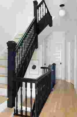
AFTER: “We opened up the bottom of the stair, added new treads to match the white oak floor, and painted the risers and balustrade,” Sheena says. Adds Lisa: “It’s hard to believe it’s the same staircase—black really is slimming!”
To guide the transformation, the couple hired designers Sheena Murphy and Tor Sauder of Nune , who spent six months implementing a series of changes designed to enhance (the team chose to expose original brick walls and update the home’s stately interior staircase, for instance)—and to simplify (the kitchen, once clad in cherry, received a dramatic facelift thanks to little more than a few coats of soft gray paint ).
“We wanted to quiet the space without wasting or spending too much,” Sheena explains. “So we didn’t replace anything but the hardware. The cabinets were removed and painted off-site, and we added matte black Park Studio L.A. hardware —easy!”
White brick and a single linear shelf are key elements of a streamlined dining area devoid of visual clutter .
Equally important as the way the space looked, however, was how it felt. “What’s great about working with Sheena and Tor is that they coached us to talk about what we wanted our home to feel like, as opposed to specific styles or exact items,” Michael says. “So instead of talking about the midcentury dining chairs we wanted, we talked about having friends over for dinner and what that experience looked like.”
BEFORE: Once used as an office , the ample but underutilized master bedroom “looked as if time had worn and discolored the space,” Sheena says.
AFTER: The updated master boasts sleek oak floors, brand-new crown molding , and a wash of white paint offset by crisp black accents.
With the second phase of the renovation soon to be under way (plans include upgrades to the bathrooms, and a possible extension), that conversation will continue. But what’s most important—the feeling of the home as a whole—has already been decided. “Ultimately,” says Lisa, “we knew we wanted a space that was calm, welcoming, and timeless.”
BEFORE: Prior to the renovation, the entryway featured green and yellow damask wallpaper , honey-toned wood floors, and a large metal light fixture.
AFTER: The designers swapped wallpaper for white paint, and parquet flooring for neutral white oak planks. Simpler decor—and a freshly painted black door—add to the clean and modern look.
A vintage marble mantel, sourced from a local salvage shop, serves as a period-appropriate finishing touch on a newly exposed fireplace. “It would have been similar in style to the original used over 100 years ago,” Sheena says.

Leave a Reply