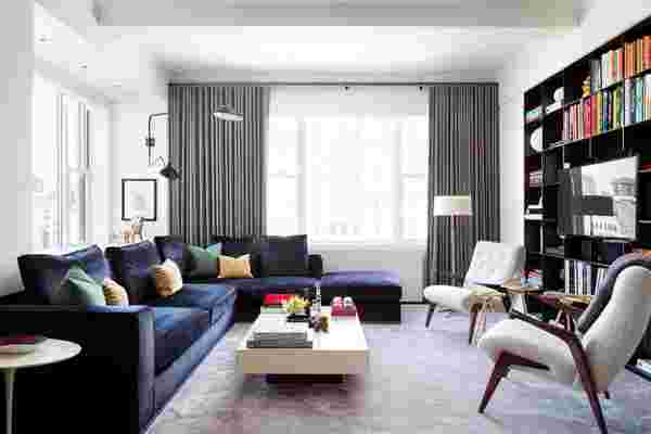
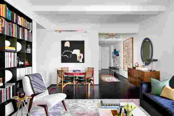
Prewar apartments in New York City are known for their small rooms, quirky layouts, and irregular architecture (asymmetrical ceiling beams, uneven floors—the works). But a good architect can see the beauty in much of that chaos and coax it into something that is not only functional but also aesthetically up to date. Such was the case for a 1,200-square-foot, two-bedroom, two-bath apartment in a historic building on Central Park West that recently got a contemporary redesign.
“Apartments of this sort are typically cut up into a collection of closed-off parcels, where rooms are isolated and tend not to flow nicely into one another,” says Matt Berman, coprincipal of Manhattan-based architectural firm Workshop/APD , who oversaw the undertaking. “This project gave us an opportunity to rethink exactly how a prewar apartment would be used today and in the future, and we homed in on precisely how the spaces should transition into each other.”
Interior designer Bryan Graybill , who began dating the homeowner while the project was under way (they are now married), quickly worked to make his mark on the apartment alongside Berman and lead architect Zachary Helmers. They collaborated to create what Berman calls a “fluid and multifunctional living environment” designed to accommodate all aspects of the couple’s lifestyle. Berman and Helmers removed walls and doorway thresholds to create an easy flow between the spaces, making each room conducive to multiple uses. The living area is equal parts salon, library, and dining room, and a notched swinging door turns the office into a guest bedroom. Concealed built-in storage and hidden doors obscure idiosyncrasies in the building’s architecture, as displayed in the master bedroom, where a wall of new closets rises up flush against an awkward ceiling beam. “Every inch was planned, and there was no wasted space,” says Graybill. “It was a pleasure to work with an architect who thought of the space almost like a yacht designer would have.”
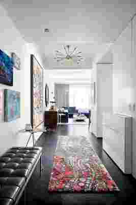
A cohesive color palette and the clean lines of midcentury modern–inspired furnishings also reinforce the fluid arrangement of the apartment’s layout. “We tried to respect much of the Art Deco ethos of the 1928 building,” says Graybill. “The previous owner made a number of mistakes in the '60s with green shag carpet and a linoleum kitchen.” In the living room, a mauve rug is a whimsical yet muted base for a navy-and-green scheme—hues that also appear in the couple’s collection of contemporary art hung gallery-style in the entry. And that kitchen? It’s now a cerused-wood-and-tile galley with plenty of cabinetry for hiding the stuff of everyday routines. “We take great pride in being able to strike the right balance between serving the needs and tastes of contemporary city life while respecting the traditions that made it possible,” says Berman. Mission accomplished.


Leave a Reply